

As part of my training course for the professional UI designer title, I carried out a project for the company 2ltronics, a company specializing in manufacturing electronic cards.
They needed to find a way to reach more people, to improve credibility and build their brand presence.
Establish a professional online presence in order to reach a wider audience. Additionally, communicating and interacting with potential future customers will enhance their awareness on the market.
As the sole UI UX Designer, I designed this project from inception to completion.
May – July 2023
To design a product that will anticipate the user pain points, I conducted a competitor’s audit. This allowed me to better understand the market and to analyze the strengths and weaknesses of my clients competitors’.
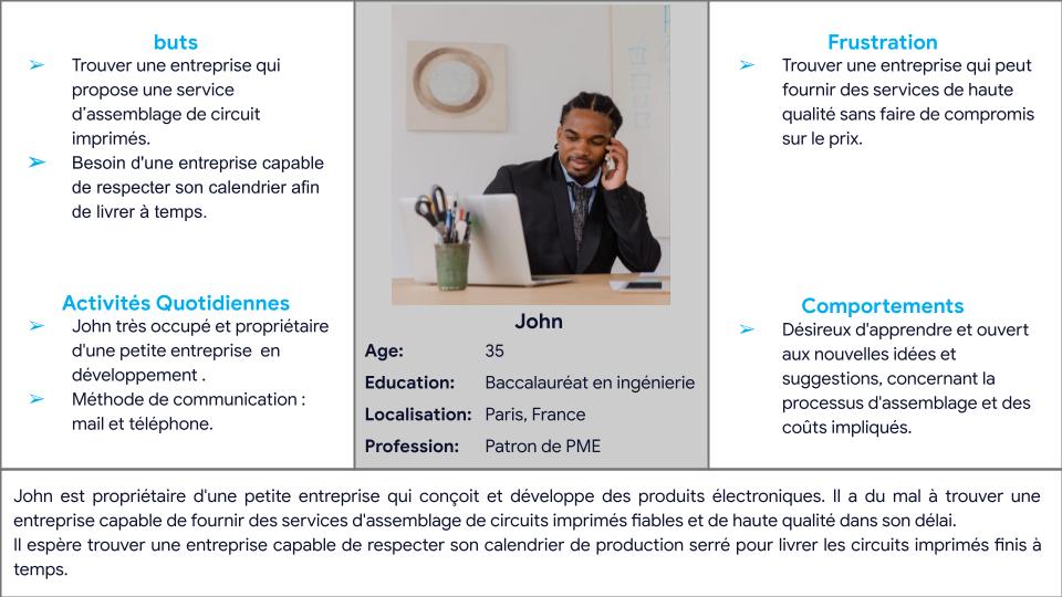
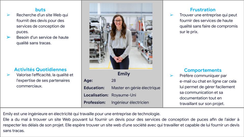
As such, my client 2ltronics managed to give me feedback on a customer’s experience on one of their competitors’ websites and shared their pain points. Synthesizing the data from my observation and attaining information, I was able to create two behavioral user personas and their pain points.
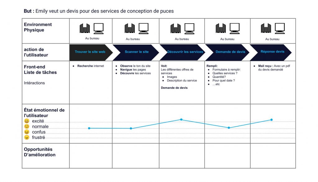
Because the pain points of the user personas are nearly similar I imagined a user journey based on Emily, knowing that there are many journeys one user can take.
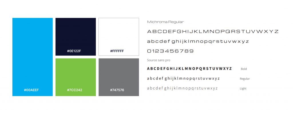
In addition, the competitor’s audit subsequently inspired the color scheme and mood for the company based on the colors used in that particular field of work. I therefore created a UI brand system that will help tell my client story to their customers.
John is busy entrepeneur who needs to find a subcontracting company in manufacturing electronic cards who can respect his tight schedule, because he wants to meet his deadlines.
If John can find 2ltronics website, he can connect with the campany and ask about manufacturing durations.
Emily is a hardworking engineer who needs to find a company in manufacturing electronic cards that provides an effortless quotation process, because she wants to meet the deadline for her project.
If Emily can find 2ltronics website, whe can easily ask for a quotation and verify if the price fits within her budget.
Color scheme :
Blue gives a sense of security and builds trust in a product. Also, blue is often associated with futuristic technology. So, for a company in manufacturing electronic cards blue was a good pick.
The company already had a dark blue from their logo, so I kept that as a secondary color along with white. Other colors such as gray and green are also in the color scheme as they are also part of that work field.
Typography :
As a typography michroma was chosen because it gives the feeling of the future.
Source sans pro exudes confidence and commands an aura of authority, especially when presented in uppercase letters, while still maintaining an elegant and visually pleasing appearance.
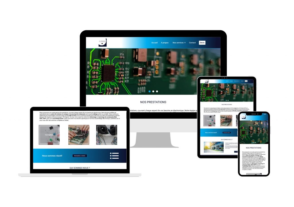
My goal for the usability study plan was to make sure that my users could easily navigate the website and ask for a quotation or get in contact with the company.
The two main findings were:
1- Service page : the user needed to scroll all the way back up to the navigation bar to ask for a quotation after finding the information. This led to frustration.
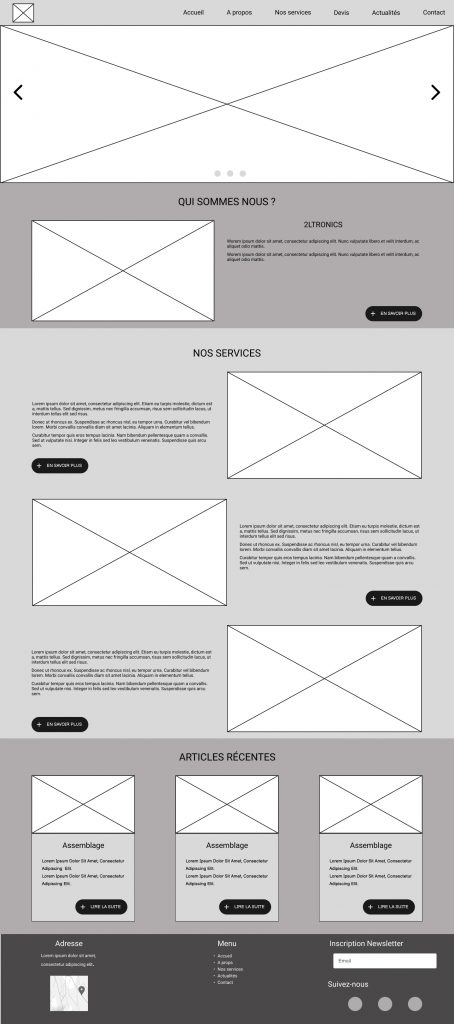
2- Homepage : The order of importance between the proposed services and about the company could lead to a loss of interest.
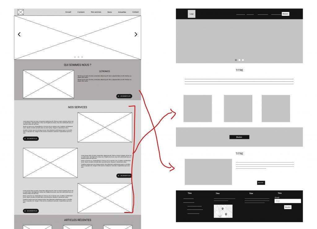
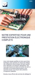
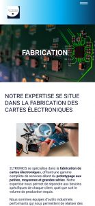
One of the big actionable insights was that users were getting overwhelmed by the amount of non-essential information (generally in this line of work people already know most of the terminology and types of services ) displayed on the homepage.
To simplify the design, I got rid of the text and made the images clickable and I reorganized the layout so that the services offered come first.
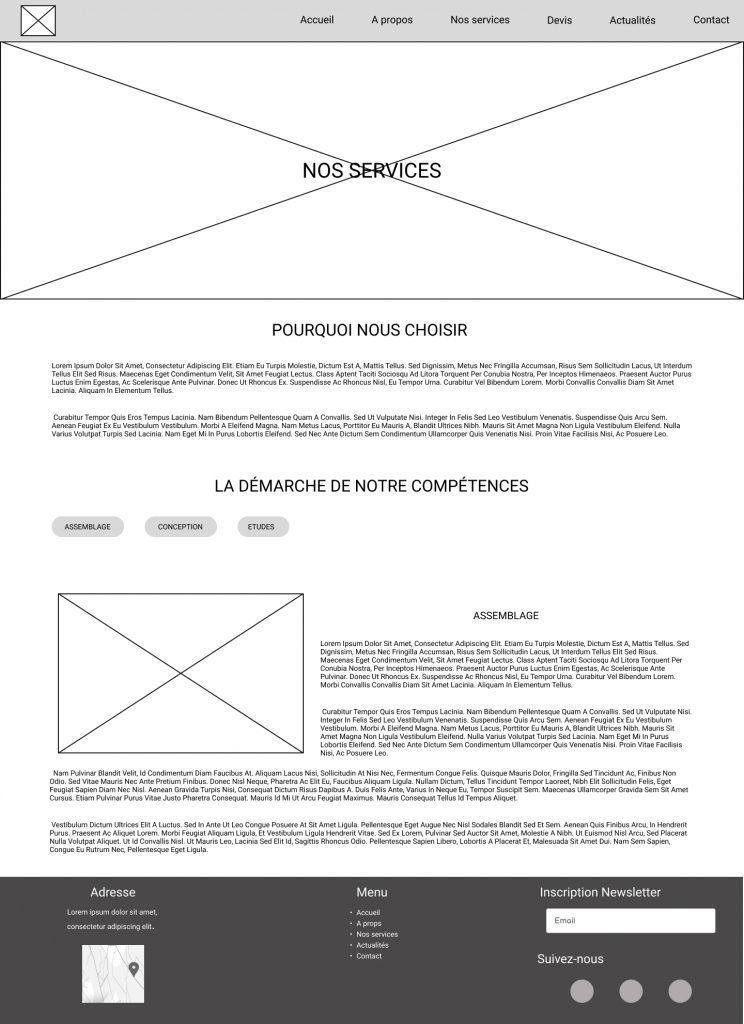
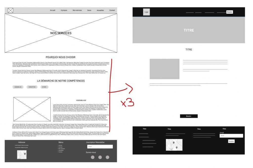
Originally I grouped all services on one page with filter buttons to filter through the three important sections. Not only was it frustrating to the user but in terms of SEO it was not the best practice.
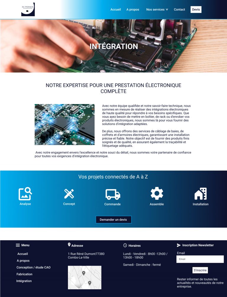
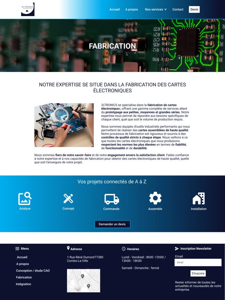
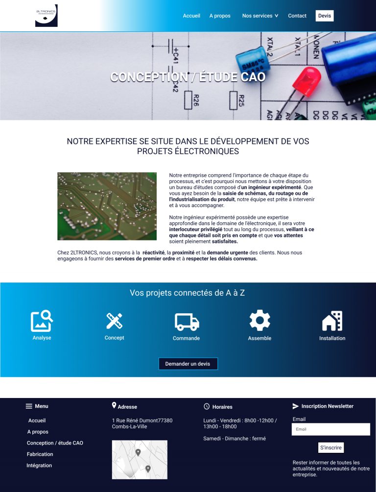
So, I redesigned the service page to a simpler and more breathable design by adding a drop down menu to the navbar, so that each section has its own page and lastly I added a quotation button to each page.
In the concluding phase of my case study, I delved into the key insights and future actions related to my project, assessing my newfound knowledge and identifying areas for improvement as I move forward.
User research plays a prominent role in the UX process. I learnt that simplicity can go a long way for reasons such as : SEO, accessibility and usability. Based on the influence of the user interviews and feedback from colleagues, I was able to iterate a comprehensive and modern design.