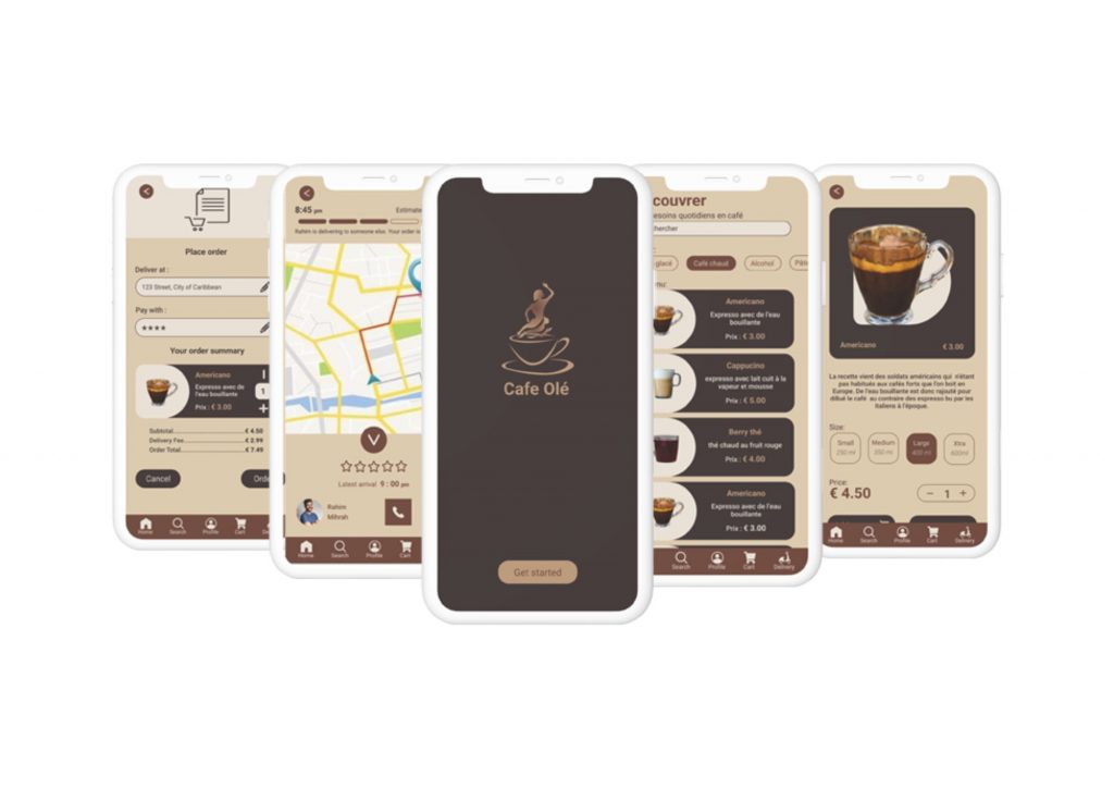
Café Olé is the name I gave to my first challenge in my Google UX Design course on the Coursera platform. This is an interactive prototype concept of a delivery tracking application.
We answer the existential question: “When will my order arrive?”
As the sole UX designer, I designed this project from inception to final design through research, ideation, and design principles.
6 weeks in 2022
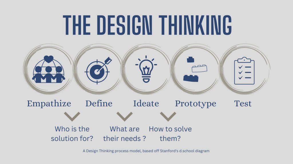
To help overcome this creative challenge, I turn to the Design Thinking approach. This methodology gives me the freedom to analyze the problem from multiple angles.
The five stages of the Design Thinking was formulated by the hasso Pattner Institute of Design in Stanford, this approach constitutes five phases of the Design Thinking process.
With major food delivery apps like Uber Eats, Just eats and Deliveroo dominating the market space, I did some research and found that most users complain about the app experience (especially order tracking status after placing it), which makes it difficult and irritating to use.
Why are users currently using the app? Is it the brand or food quality?
What are the current problems that users face while using these apps ?
What are specific issues related to the food tracking system ?
Most users complain about not being able to contact the delivery person or get assistance if the delivery person is not in the right place, or the delivery person has not been moving for a while, which makes it unmemorable. With an order tracking system, these are the UI/UX challenges that we face while designing for Cafe Olé.
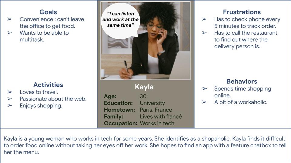
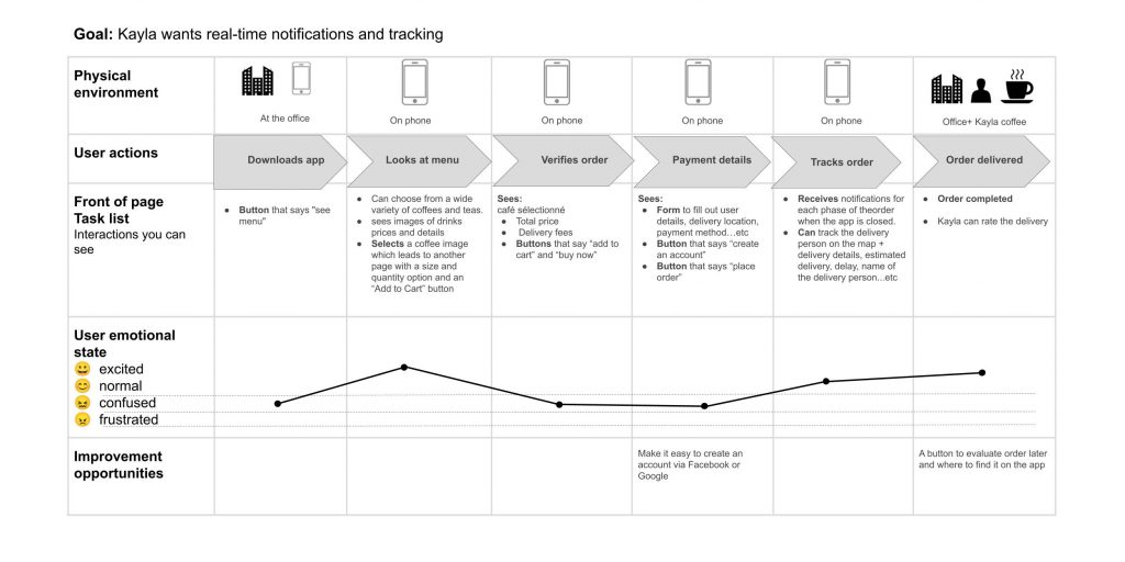
Kayla is a young workaholic who needs a way to keep track of her order without compromising on work time, because she hates to waste time.
If Kayla downloads the app she can benefit from push notifications to keep track of her order and see the delivery person on the map.
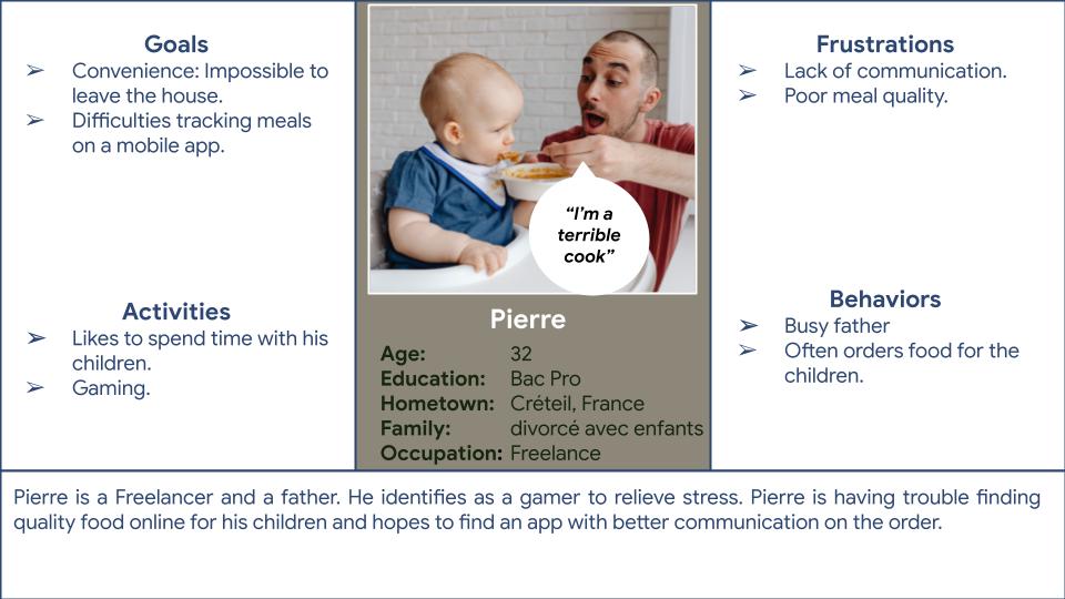
Pierre is a busy father and a terrible cook who needs to find quality food for his children, because he wants them to enjoy food while getting the nutrition they need.
If Pierre downloads the app he can see that the app is specific to one cafe and can hope that the food will reach his doorstep with better care.
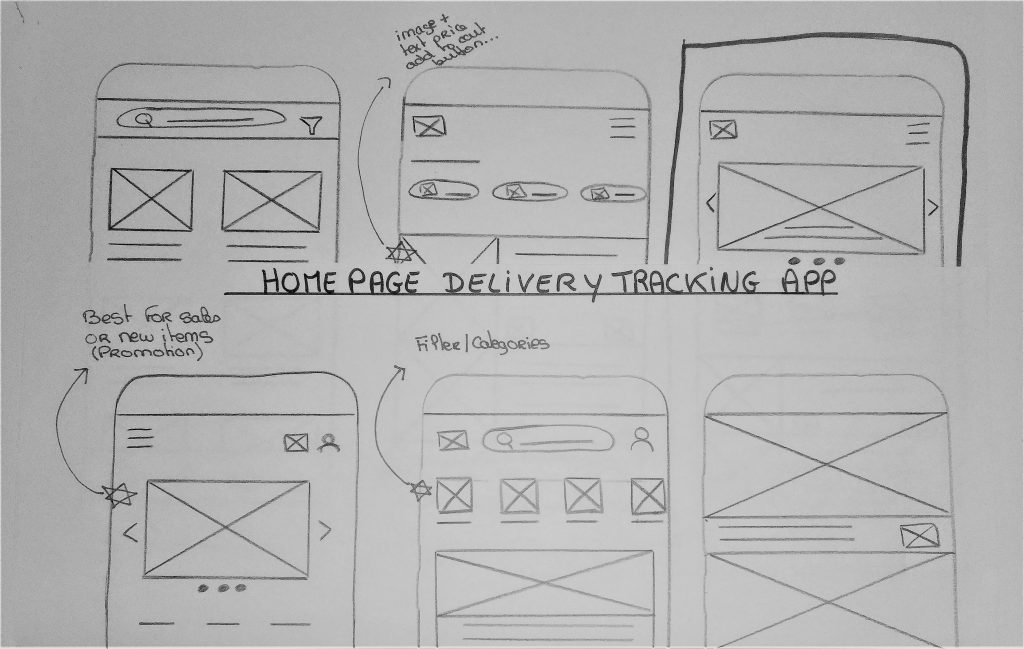
Utilizing paper wireframes proves to be a fast and easy method for UX designers to efficiently iterate and address design concepts. I employed paper wireframing to promptly tackle various concepts related to user pain points that surfaced during my user research.
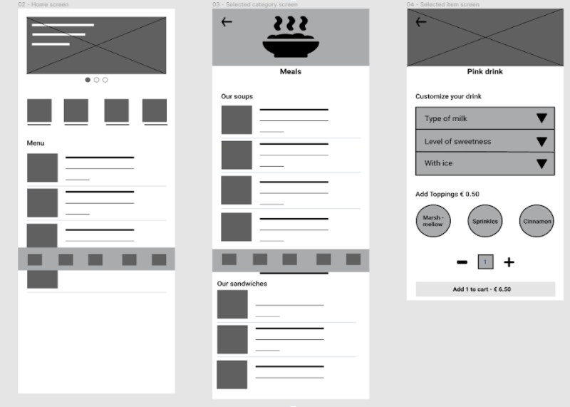
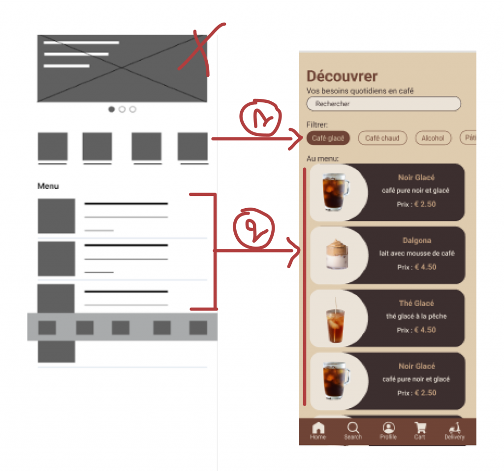
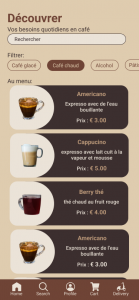
1 – In the first frame the gategories section would take the user to another page prolonging their journey on the app which could lead to a loss of engagement.
By switching to a home filter option the user can get to their goal faster which improves on efficiency.
2 – Following the Gestat principles of visual perception, I better grouped the elements by proximity and similarity by color, shape, size, texture, and orientation as being part of a set.

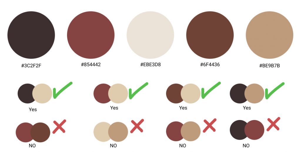
1 – Provided access to users who are vision impaired
I ensured accessibility in my app design by meticulously selecting and fine-tuning color combinations based on the recommendations provided by the WebAIM Contrast Checker website. This approach allowed me to create a user-friendly interface with optimal color contrast for improved readability and usability.
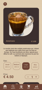
2 – Paired aicons with text to avoid confusion
Not all users have the same level of familiarity with icons or the ability to interpret them accurately. By including text labels alongside icons, I ensure that users can understand the functions or actions associated with those icons, regardless of their familiarity or cognitive abilities.
What I learned:
While designing Café Olé delivery tracking app, I learned that the first ideas for the app are only the beginning of the process. Usability studies and peer feedback influenced each iteration of the app’s designs.
Going forward:
Conducting another round of usability studies would help to validate whether the pain points users experienced have been effectively addressed.